A Modern Guide | Linearity and Non-Linearity in Machine Learning
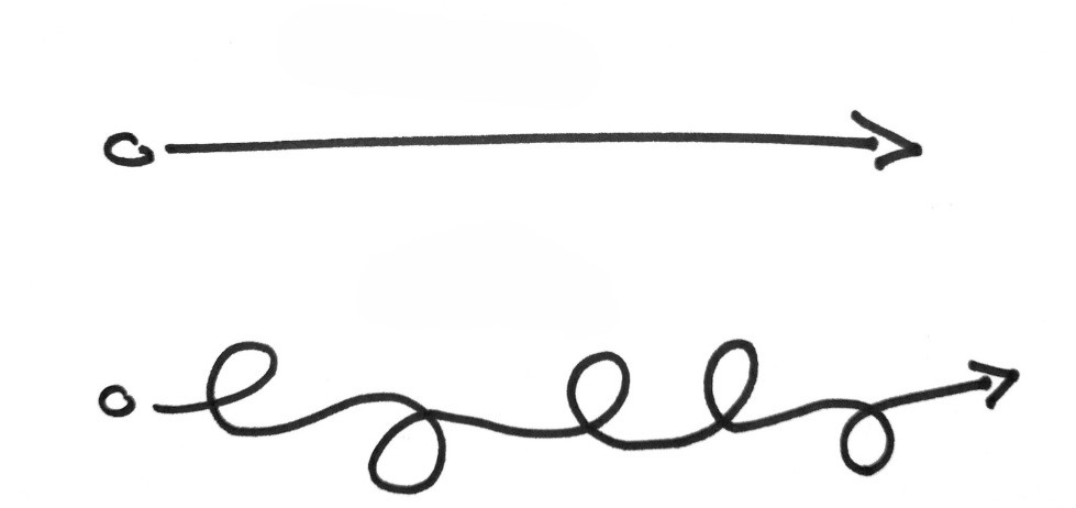
Understanding linearity and non-linearity in machine learning is like learning the alphabet before reading a book—they're fundamental concepts that guide how we model data. Linearity involves relationships that can be represented by straight lines, such as how driving at a constant speed leads to proportional increases in distance traveled.
Linearity and Non-Linearity in Machine Learning: A Modern Guide
In machine learning, understanding the concepts of linearity and non-linearity is like learning the alphabet before reading a book. These principles shape the way we build algorithms and model data. But what do these terms really mean, and why do they matter?
Let’s dive into the world of linearity and non-linearity with a focus on real-life examples, visualizations, and applications in machine learning.
What is Linearity?
At its core, linearity refers to a relationship between input and output that can be expressed as a straight line. In other words, changes in the input lead to proportional changes in the output.
Imagine you’re driving at a constant speed of 60 km/h. The relationship between your speed and the distance you travel is linear. For every additional hour you drive, you’ll travel 60 km more. This can be expressed in a simple mathematical formula:
\[Distance = Speed × Time = 60 × t\]Real Life Example: Predicting Income
A common example of linearity is predicting income based on years of experience. Let’s assume that for every year of experience, income increases by a fixed amount:
\[Income = w ⋅ Experience + β\]
Where:
- \(w\) is the slope, representing how much income increases per year of experience.
- \(β\) is the intercept, representing the starting income with zero experience.
This simple relationship can often approximate real-world data surprisingly well.
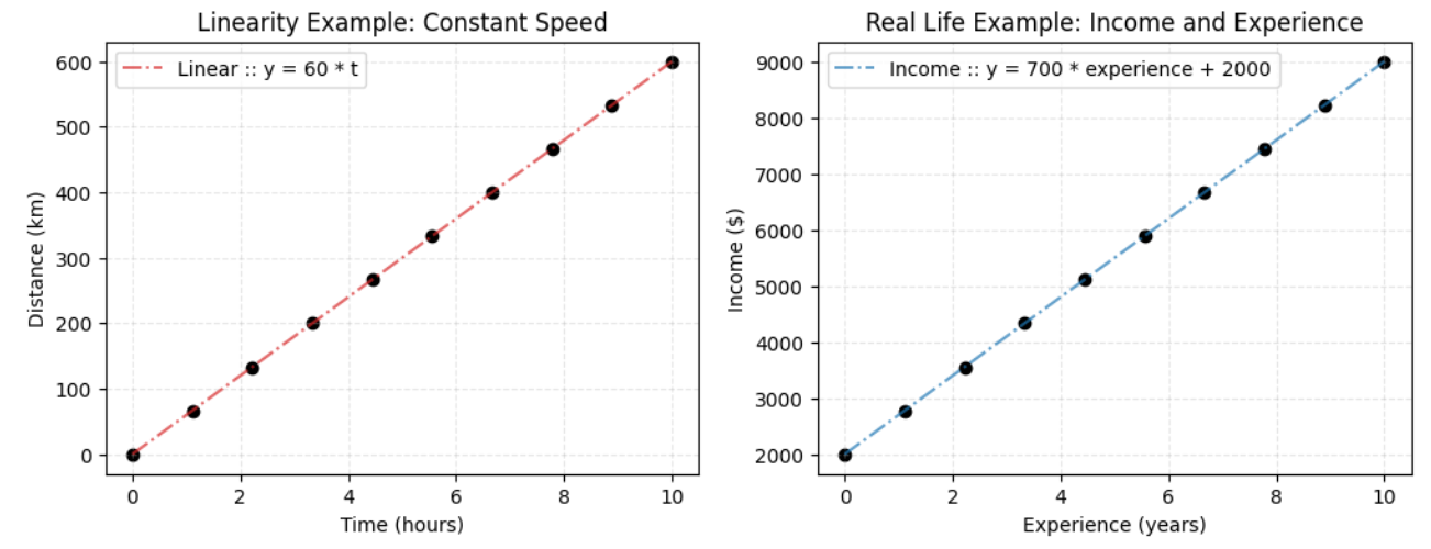 Figure 1
What is Non-Linearity ?
Non-linearity, on the other hand, represents relationships that cannot be expressed by a straight line. In these cases, changes in the input lead to disproportionate changes in the output.
Imagine you’re driving, but this time you’re navigating hills, valleys, and sharp turns. Your speed will vary depending on whether you’re going uphill, downhill, or turning sharply. The relationship between your speed and time won’t be a straight line anymore, but rather a curve. Here’s a formula that might capture that:
\[Speed = w_1 ⋅ Slope + w_2 ⋅ Turn Sharpness + β\]
This non-linear relationship reflects the fact that the speed isn’t constant—it depends on complex factors like the slope of the road and how sharp the turns are.
Real-Life Example: House Prices
In real estate, house prices often exhibit non-linear relationships with features like size, location, and age. For instance, doubling the size of a house doesn’t necessarily double its price. Instead, the price might increase exponentially as the house gets larger or is located in a prime area.
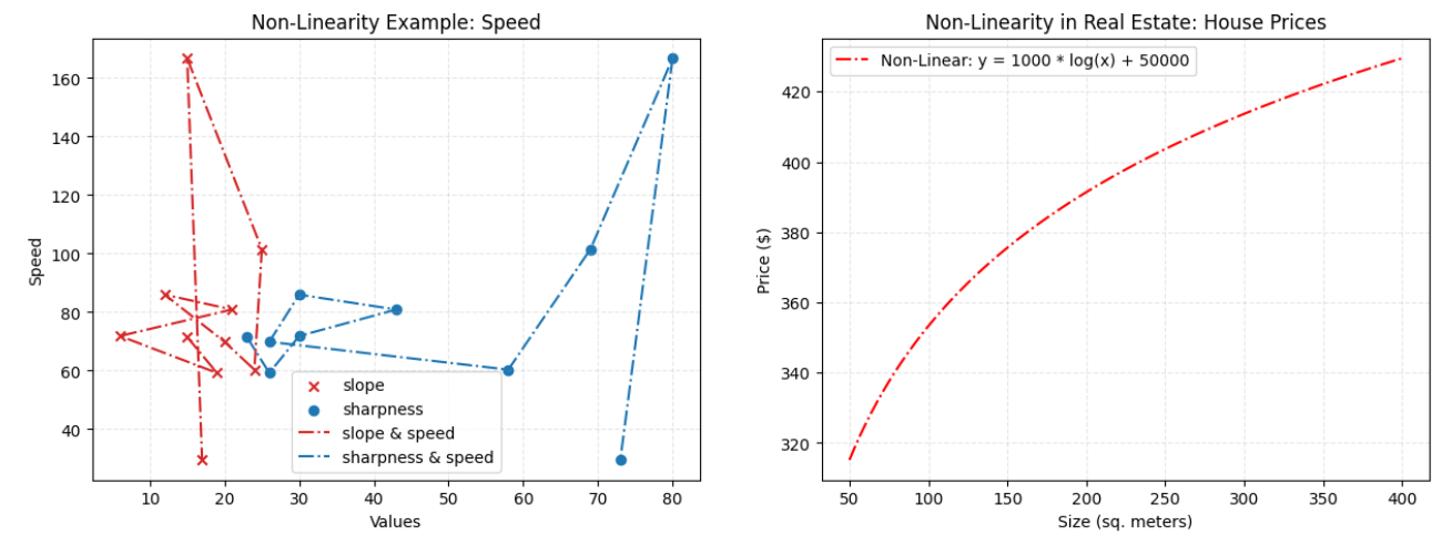 Figure 2 The graph on the left shows the relationship between the dependencies of the speed variable on slope and sharpness values. As can be seen, there is no linear increase or decrease, that is, there is a non-linear situation. Although the data was not prepared very well because the data was generated randomly, I think I was able to explain the subject. In the graph on the right, if we consider the problem of house price estimation, which may have a non-linear relationship in real life, it can be seen that there is a non-linear but increasing relationship between the size of the house and its price.
If we assume that speed has linear relations with other values. Then you will see a 3D Plot like that:
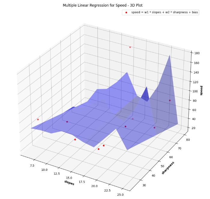 Figure 3
More real life example:
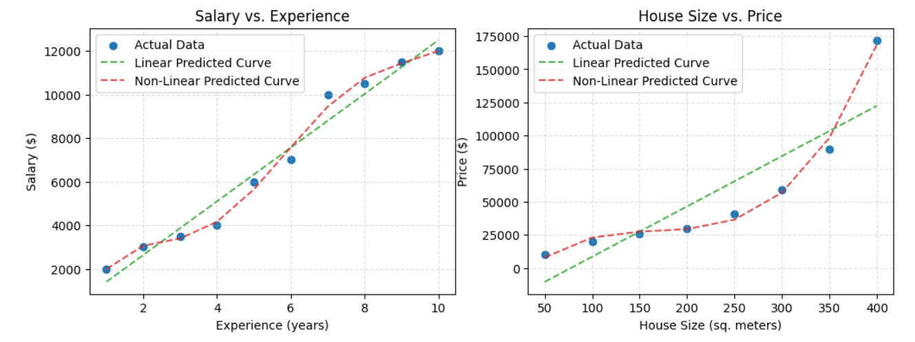 Figure 4
Model calculations were made and visualized by assuming that there was a linear or non-linear relationship between the two features on the above graphs. The dataset has been prepared intuitively by hand and will be shared with all plot codes at the end of the article. For the example on the left, a scenario between salary and years of experience is considered. In the example on the right, the scenario of house prices and sizes is taken as an example.
Comparison of Linearity and Non-Linearity in Machine Learning
| Aspect | Linear Models | Non-Linear Models |
|---|---|---|
| Relationship Type | Straight line, proportional changes | Curved or complex, disproportionate changes |
| Complexity | Simple, easy to interpret | More complex, harder to interpret |
| Use Cases | Simple relationships (e.g., income vs. experience) | Complex relationships (e.g., image recognition) |
| Algorithms | Linear regression, logistic regression | Decision trees, neural networks, SVM |
| Computation | Fast and computationally efficient | Slower and more computationally expensive |
Conclusion
In summary, understanding the difference between linear and non-linear relationships is fundamental to building effective machine learning models. While linear models are easy to interpret and work well for simpler relationships, non-linear models allow us to tackle more complex real-world problems where data relationships are not so straightforward.
Both types of models have their place in machine learning, and knowing when to use each is key to creating models that can make accurate predictions. As we move forward into more advanced algorithms, these foundational concepts will serve as the building blocks for understanding more sophisticated methods like neural networks, random forests, and support vector machines.
Codes
Figure 1
1
2
3
4
5
6
7
8
9
10
11
12
13
14
15
16
17
18
19
20
21
22
23
24
25
26
27
28
29
30
31
import numpy as np
import matplotlib.pyplot as plt

# Plot linear relationship
time = np.linspace(0, 10, 10)
distance = 60 * time

plt.figure(figsize=(12,4))
plt.subplot(1,2,1)
plt.scatter(time, distance, color='black',marker='o')
plt.plot(time, distance, color='tab:red', linestyle='-.',label='Linear :: y = 60 * t',alpha=.7)
plt.xlabel('Time (hours)')
plt.ylabel('Distance (km)')
plt.title('Linearity Example: Constant Speed')
plt.legend()
plt.grid(True,alpha=.3,linestyle='--')

plt.subplot(1,2,2)
experience = np.linspace(0, 10, 10)
bias = 2000
weight = 700
income = weight * experience + bias

plt.scatter(experience, income, color='black',marker='o')
plt.plot(experience, income, color='tab:blue', linestyle='-.',label='Income :: y = 700 * experience + 2000',alpha=.7)
plt.xlabel('Experience (years)')
plt.ylabel('Income ($)')
plt.title('Real Life Example: Income and Experience')
plt.legend()
plt.grid(True,alpha=.3,linestyle='--')
plt.show()
Figure 2
1
2
3
4
5
6
7
8
9
10
11
12
13
14
15
16
17
18
19
20
21
22
23
24
25
26
27
28
29
30
31
32
33
34
35
36
37
38
import numpy as np
import matplotlib.pyplot as plt

np.random.seed(1234)
plt.figure(figsize=(15,5))
plt.subplot(1,2,1)

speed_bias = 20
slopes = np.random.randint(low=0,high=30,size=10)
sharpness = np.random.randint(low=0,high=90,size=10)
weight_of_slopes = np.random.uniform(low=-1,high=1,size=10)
weight_of_sharpness =  np.random.uniform(low=-1,high=1,size=10)
initial_speed = 60
speed = initial_speed + (weight_of_slopes * (slopes)) + (weight_of_sharpness * sharpness) + speed_bias

plt.scatter(slopes, speed, color='tab:red', marker='x',label='slope')
plt.scatter(sharpness, speed, color='tab:blue', marker='o',label='sharpness')
plt.plot(slopes, speed, color='tab:red', linestyle='-.',label='slope & speed')
plt.plot(sharpness, speed, color='tab:blue', linestyle='-.',label='sharpness & speed')
plt.xlabel('Values')
plt.ylabel('Speed')
plt.title('Non-Linearity Example: Speed')
plt.legend()
plt.grid(True,alpha=.3,linestyle='--')

plt.subplot(1,2,2)
house_sizes = np.linspace(50, 400, 100)
house_weights = 55
house_bias = 100
house_prices = house_weights * np.log(house_sizes) + house_bias

plt.plot(house_sizes, house_prices, color='red', linestyle='-.',label='Non-Linear: y = 1000 * log(x) + 50000')
plt.xlabel('Size (sq. meters)')
plt.ylabel('Price ($)')
plt.title('Non-Linearity in Real Estate: House Prices')
plt.legend()
plt.grid(True,alpha=.3,linestyle='--')
plt.show()
Figure 3
1
2
3
4
5
6
7
8
9
10
11
12
13
14
15
16
17
18
19
20
21
22
23
24
# note: figure 3 codes is realted with figure 2 code plot 1
slopes_grid, sharpness_grid = np.meshgrid(np.linspace(slopes.min(), slopes.max(), len(slopes)),
                               np.linspace(sharpness.min(), sharpness.max(), len(sharpness)))

initial_speed = 60
speed_grid =  initial_speed + (weight_of_slopes * (slopes_grid)) + (weight_of_sharpness * sharpness_grid) + speed_bias

# Create a 3D plot
fig = plt.figure(figsize=(12,15))
ax = fig.add_subplot(111, projection='3d')

# Plot the data points
ax.scatter(slopes, sharpness, speed, color='red', marker='o',label='speed = w1 * slopes + w2 * sharpness + bias')

# Plot the plane with color fill
ax.plot_surface(slopes_grid, sharpness_grid, speed_grid, color='blue', alpha=0.4,rstride=5,cstride=5)

# Labels and title
ax.set_xlabel('slopes',fontweight='bold')
ax.set_ylabel('sharpness',fontweight='bold')
ax.set_zlabel('speed',fontweight='bold')
ax.set_title('Multiple Linear Regression for Speed - 3D Plot ')
plt.legend()
plt.show()
Figure 4
1
2
3
4
5
6
7
8
9
10
11
12
13
14
15
16
17
18
19
20
21
22
23
24
25
26
27
28
29
30
31
32
33
34
35
36
37
38
39
40
41
42
43
44
45
46
47
48
49
50
51
52
53
54
55
56
57
58
59
60
61
62
63
64
import pandas as pd
from sklearn.linear_model import LinearRegression
from sklearn.preprocessing import PolynomialFeatures
from sklearn.pipeline import make_pipeline

# Create dataset
house_data = {
    'Size': [50, 100, 150, 200, 250, 300, 350, 400],
    'Price': [10000, 20000, 26000, 30000, 41000, 59000, 90000, 172000]
}
df_house = pd.DataFrame(house_data)

# Create a simple dataset
salary_data = {
    'Years_of_Experience': [1, 2, 3, 4, 5,6,7,8,9,10],
    'Salary': [2000,3000, 3500, 4000,6000, 7000,10000,10500,11500,12000]
}
df_salary = pd.DataFrame(salary_data)
X_salary = df_salary[['Years_of_Experience']]
y_salary = df_salary['Salary']

salary_poly_model = make_pipeline(PolynomialFeatures(degree=5), LinearRegression())
salary_poly_model.fit(X_salary, y_salary)

salary_lr_model  =  LinearRegression()
salary_lr_model.fit(X_salary, y_salary)

y_salary_pred_nonlinear = salary_poly_model.predict(X_salary)
y_salary_pred_linear = salary_lr_model.predict(X_salary)

plt.figure(figsize=(12,4))
plt.subplot(1,2,1)
plt.scatter(X_salary, y_salary, color='tab:blue', label='Actual Data')
plt.plot(X_salary, y_salary_pred_linear, linestyle='--',color='tab:green',alpha=.8, label='Linear Predicted Curve')
plt.plot(X_salary, y_salary_pred_nonlinear, linestyle='--',color='tab:red',alpha=.8, label='Non-Linear Predicted Curve')
plt.xlabel('Experience (years)')
plt.ylabel('Salary ($)')
plt.title('Salary vs. Experience')
plt.legend()
plt.grid(True,linestyle='--',alpha=.4)

# Polynomial Regression (Non-linear)
X_house = df_house[['Size']]
y_house = df_house['Price']
house_poly_model = make_pipeline(PolynomialFeatures(degree=3), LinearRegression())
house_poly_model.fit(X_house, y_house)

house_lr_model  =  LinearRegression()
house_lr_model.fit(X_house, y_house)

# Predict and plot
y_house_pred_nonlinear = house_poly_model.predict(X_house)
y_house_pred_linear = house_lr_model.predict(X_house)

plt.subplot(1,2,2)
plt.scatter(X_house, y_house, color='tab:blue', label='Actual Data')
plt.plot(X_house, y_house_pred_linear, linestyle='--',color='tab:green',alpha=.8, label='Linear Predicted Curve')
plt.plot(X_house, y_house_pred_nonlinear, linestyle='--',color='tab:red',alpha=.8, label='Non-Linear Predicted Curve')
plt.xlabel('House Size (sq. meters)')
plt.ylabel('Price ($)')
plt.title('House Size vs. Price')
plt.legend()
plt.grid(True,linestyle='--',alpha=.4)
plt.show()